
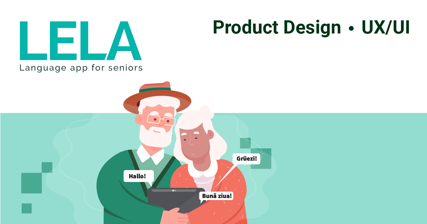
Lela is a web application designed as an educational tool for senior people to learn a foreign language.
This will be a self-paced tool based on learner responses and needs. This project aims to help senior citizens to learn to communicate in a foreign language, boost self-esteem and improve/preserve the cognitive skills they have. For the pilot stage, it will be designed for English native speakers to learn German.

The challenge
The challenge was to design the interfaces and the interactions that are best fit for senior people, taking into account accessibility, technical savvy knowledge, and user behaviors.
The Problem
Due to the increased mobility, lots of senior people need to travel to visit their adult children and grandchildren in foreign countries and they need a safe, simple to use tool to communicate with and understand the people around them. The multitude of situations/contexts and the anxiety of a new place can make them feel lost, insecure, break their self-esteem and cause a lack of interest in further visiting. They need customizable guidance, repeatable and patience explanations for a multitude of basic things.

Scope and constrains
I started this project as part of my studies at UC San Diego, Principle of UX Design Course, with the guidance of prof.Kristian Secor. I am the sole designer in this project. The timeline was 7 weeks. The tools I used are Adobe Illustrator, Adobe Indesign, Adobe Photoshop and Adobe XD.
The Process
I used the wheel UX lifecycle process (Understand - Design - Prototype - Evaluate) in combination with the agile UX funnel. This lead to narrowing the scope of the project, aiming for quality over quantity.
Research & Analyzing
Hypothesis
Old people want to travel more often without being dependent to someone else to with translation, therefore they need to understand and communicate in a foreign language on their own.
They need a customizable tool based on personal needs, the context of use, with repeatable actions.
They also need to boost self-esteem and to improve/preserve the cognitive skills they have.
The desired design will be accessed mostly from the tablet.
Old people want to continue to learn.
Old people are also interested in the use of technology / digital devices also.
Due to the increased mobility, lots of senior people need to travel to visit their adult children and grandchildren in foreign countries and they need a safe, simple to use tool to communicate with and understand the people around them. The multitude of situations/contexts and the anxiety of a new place can make them feel lost, insecure, break their self-esteem and cause a lack of interest in further visiting. They need customizable guidance, repeatable and calming explanations for a multitude of basic things.
A study confirmed that senior citizens prefer to learn ICT (Information and Communication Technologies) based on instructions from manuals or teachers, rather than by trial-and-error approaches. (from the book “Universal Access in Human-Computer Interaction. Users and Context Diversity ” by Antona, Margherita, Stephanidis, Constantine)
Age-related impairments: vision (reduced contrast sensitivity, color perception, near focus), physical ability (reduced dexterity and fine motor control, difficulties to use a mouse and click small targets), hearing (difficulty hearing high pitched sounds and separating sounds, difficulty to hear audio when there is background music), cognitive ability (reduced short - term memory, difficulty concentrating, being easily distracted).
After interviewing some prospective users, making the contextual observations and consulting World Accessibility Standards, here are some of the findings.
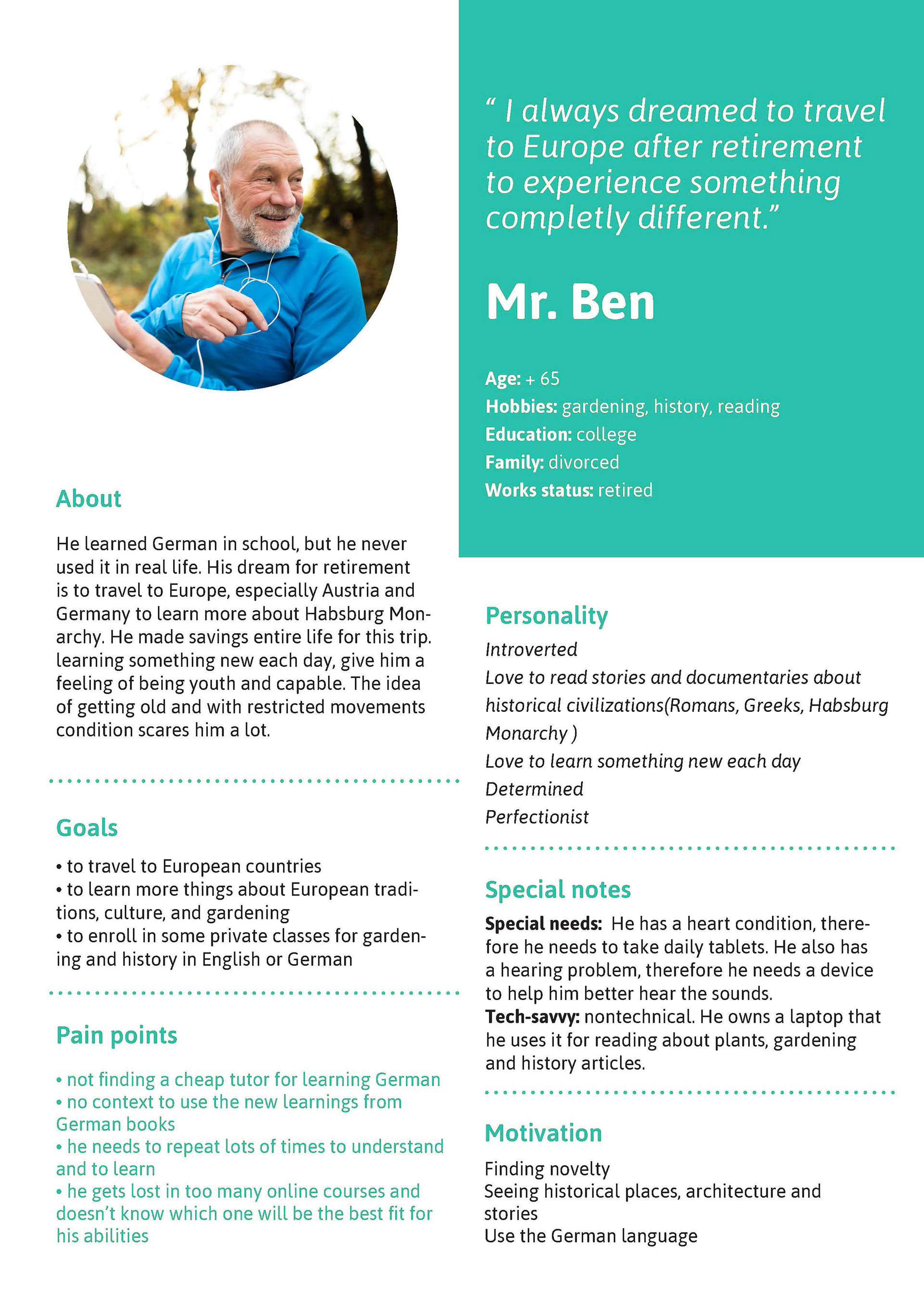
Personas
The further personas are created with a combination of real raw data, observations from a contextual inquiry that I've made, representing prospective users of my design. The solution to be found is meant to be for individual users, not for businesses. (Business to Customer).

The Design opportunity (defining the point of view)
Older adults need a way to communicate in a foreign language while traveling abroad.
Older adults need a way to learn a foreign language pleasantly and appropriately to their abilities and understandings.
Older adults need a safe tool that boosts their self-confidence and makes them feel empowered. so that they can travel or do simple tasks unaccompanied in new places.
Older adults who travel abroad need to perform complicated tasks, but they need a way to communicate and understand people from that country.
Old adults that travel need a basic set of words and phrases for most common situations & context (airport check, buying tickets, asking for direction, shopping, ordering to eat&drinks, ask for help, give briefly reasons or explanations, read street/store signs and announcements).
Social and mental models
Older adults prefer to connect with smaller, more intimate groups of people.
Older users who aren’t familiar with technology often already feel insecure while using it; a condescending message will only cause further insecurity and may turn them off to using the app altogether.
Older users who aren’t familiar with technology often already feel insecure while using it; a condescending message will only cause further insecurity and may turn them off to using the app altogether.
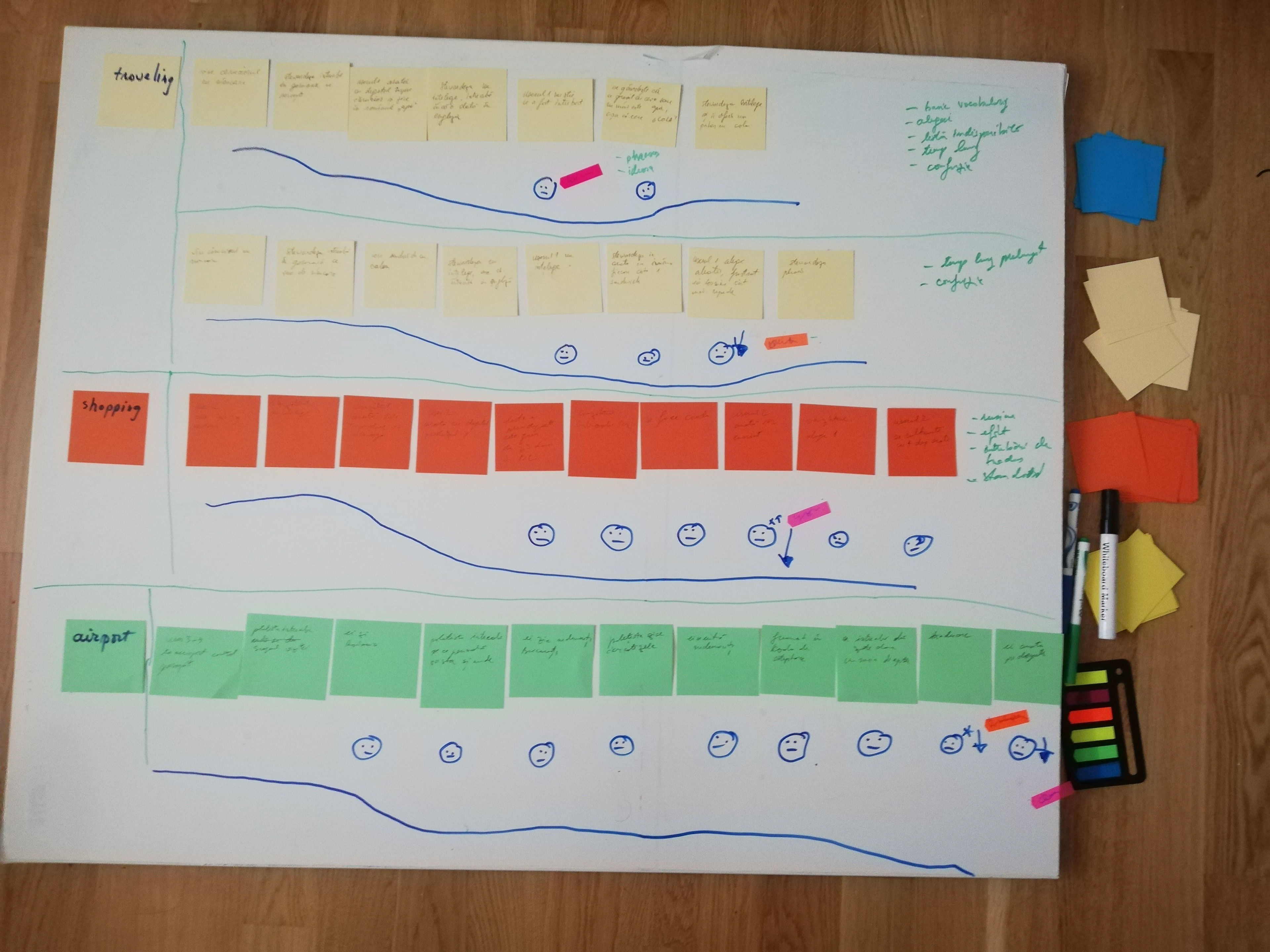
Customer journey with real scenarios
The Design
Using the persona scenario, I made the usage storyboard for the future application.
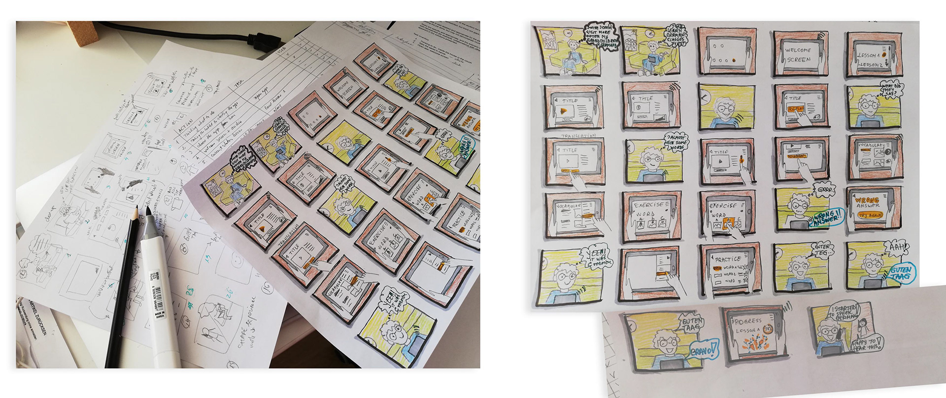
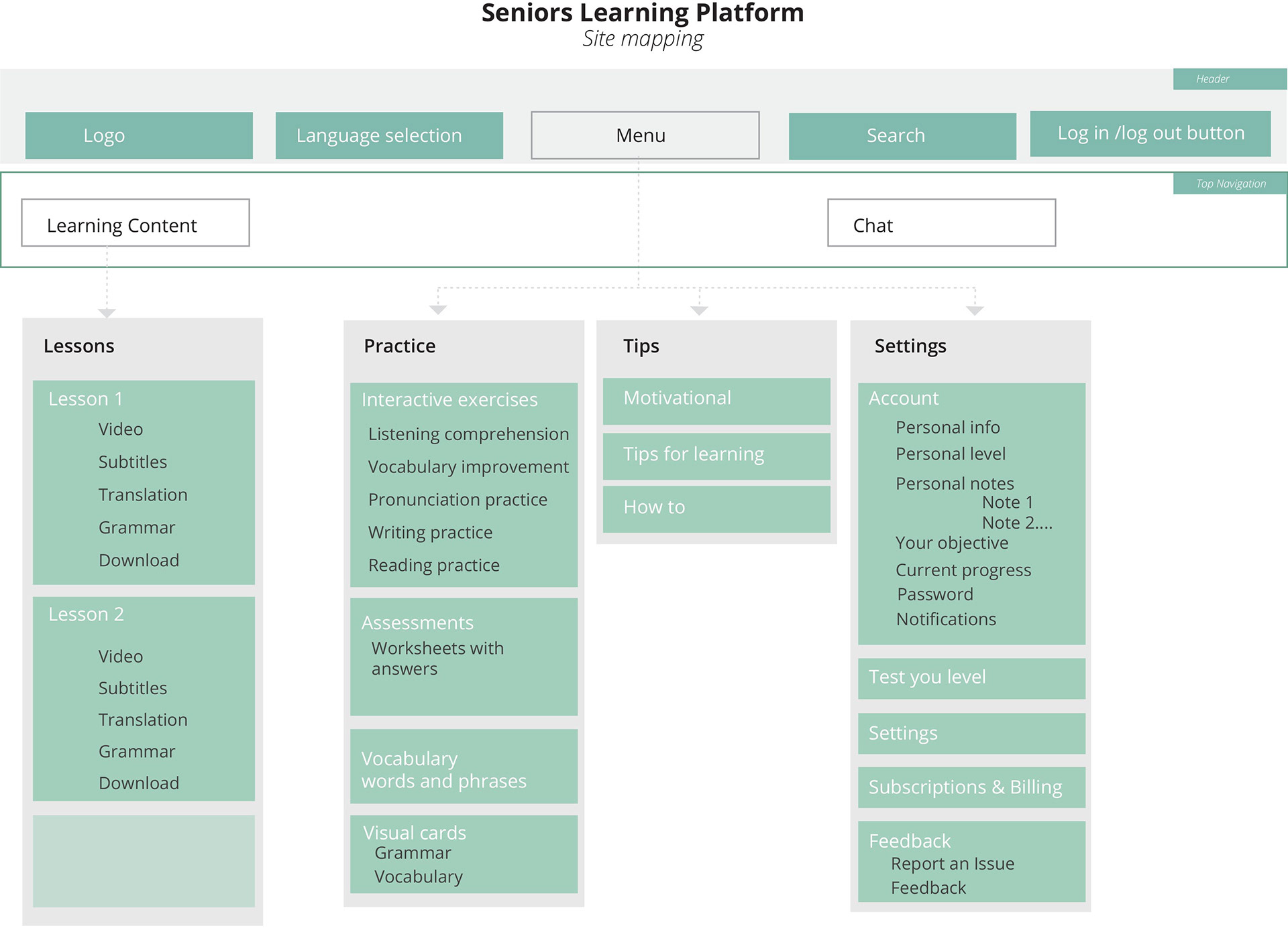
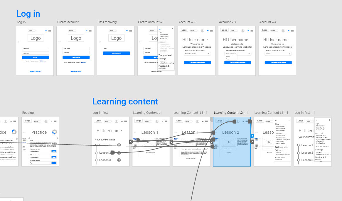
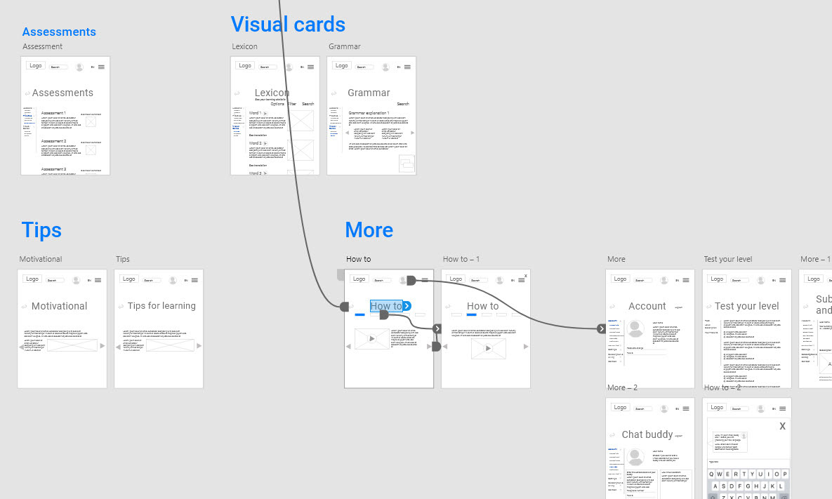
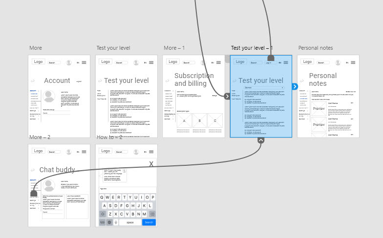
Sketches of the future product and Information architecture.
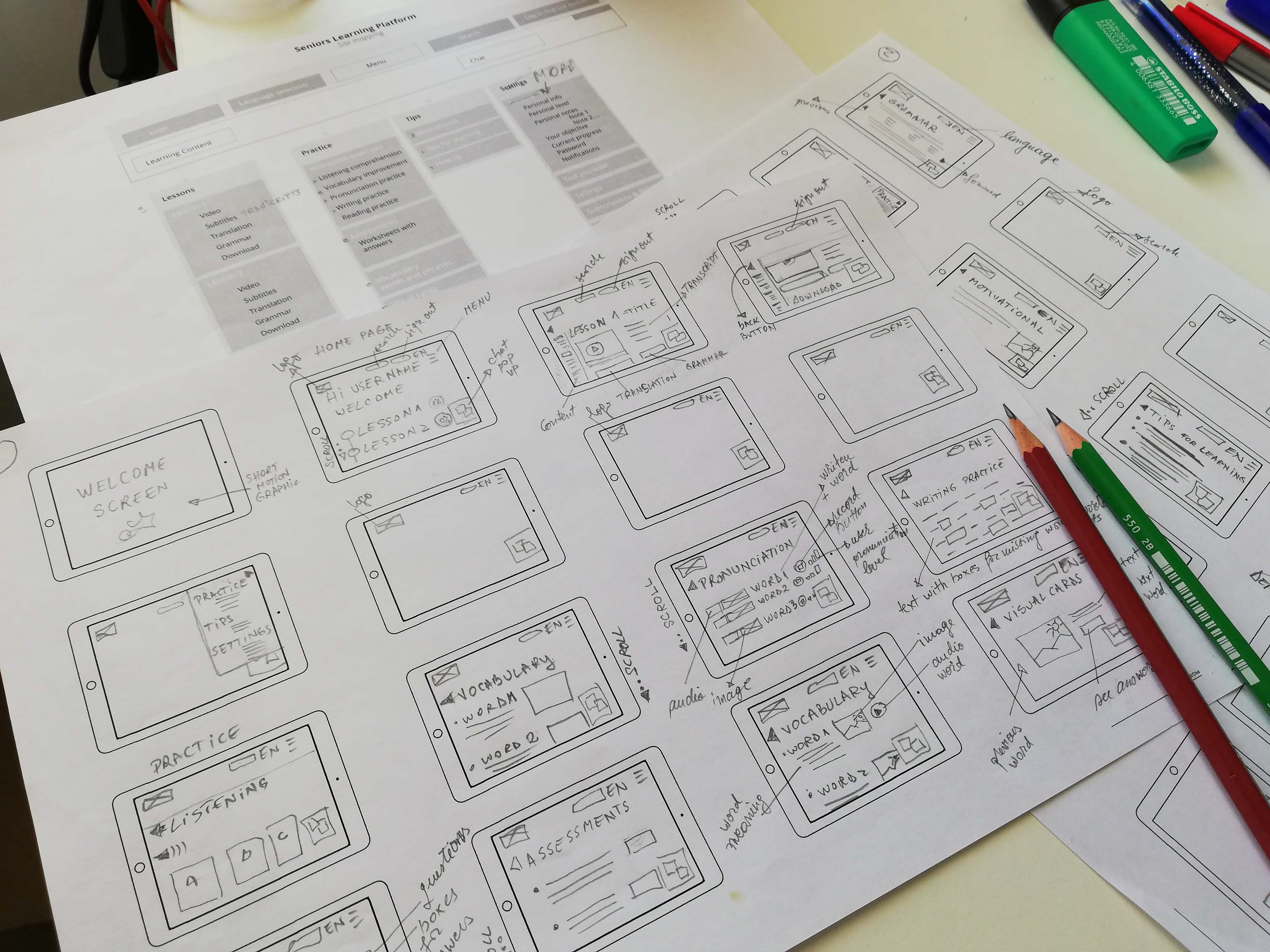
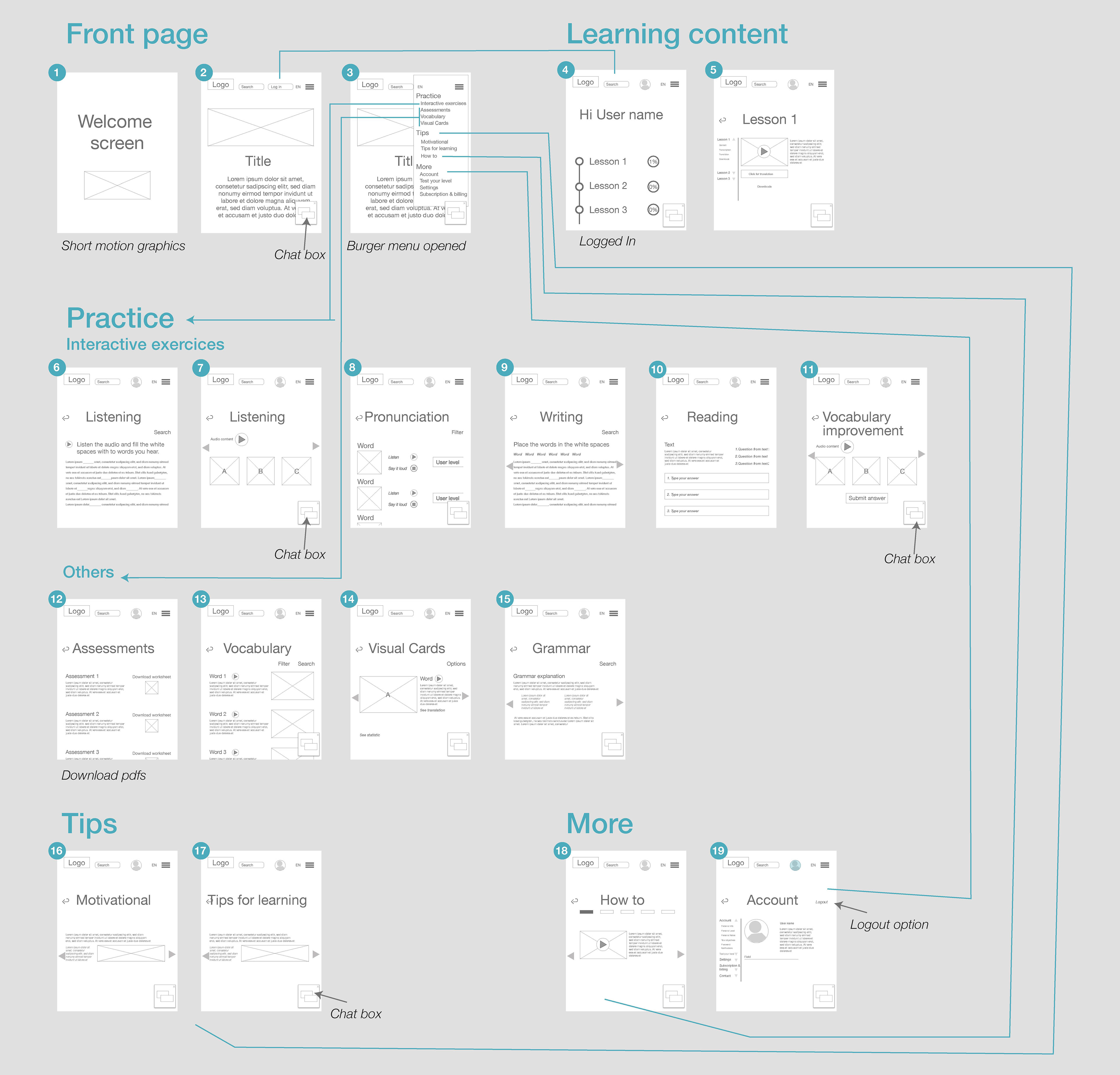
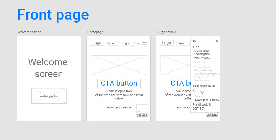
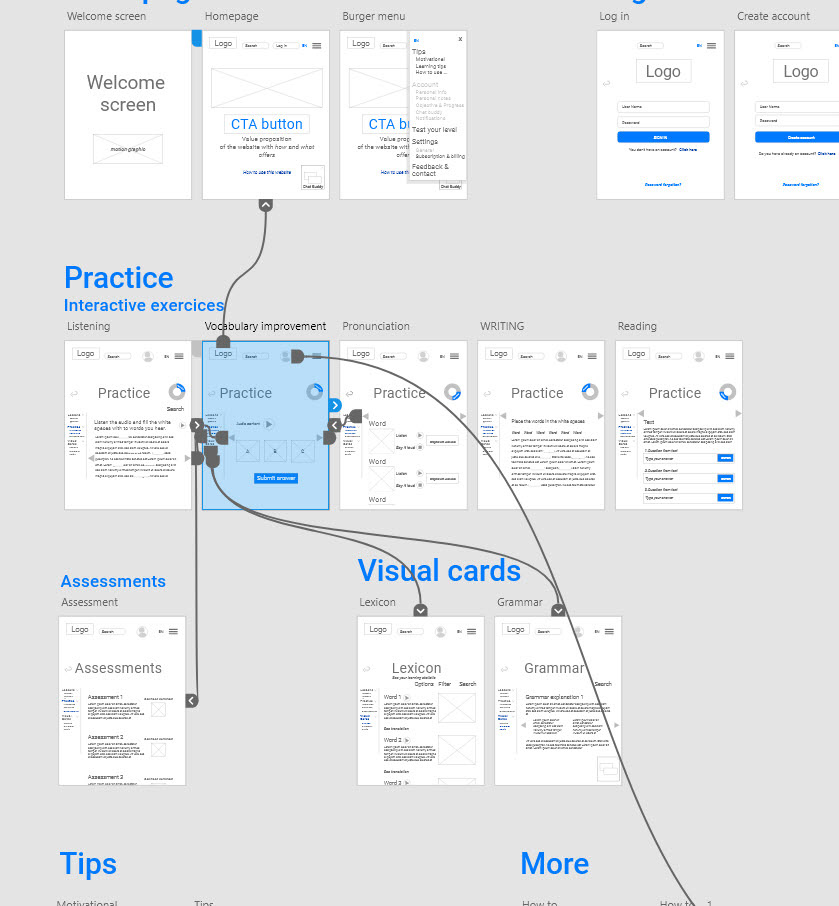
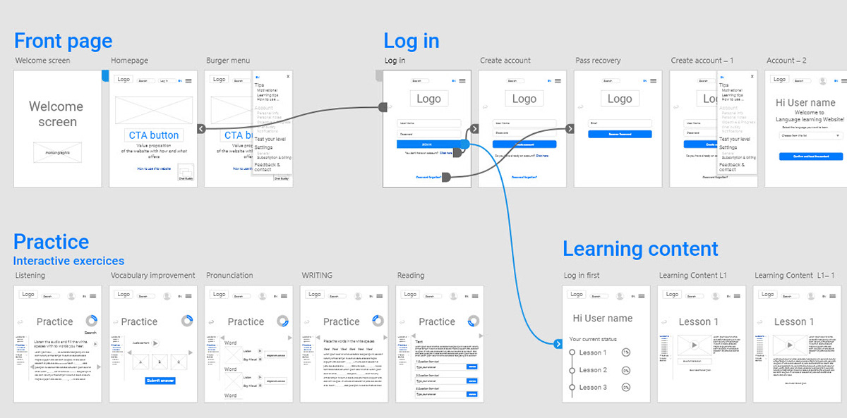
Wireframes screens with annotations and interactivity hints.
Prototyping
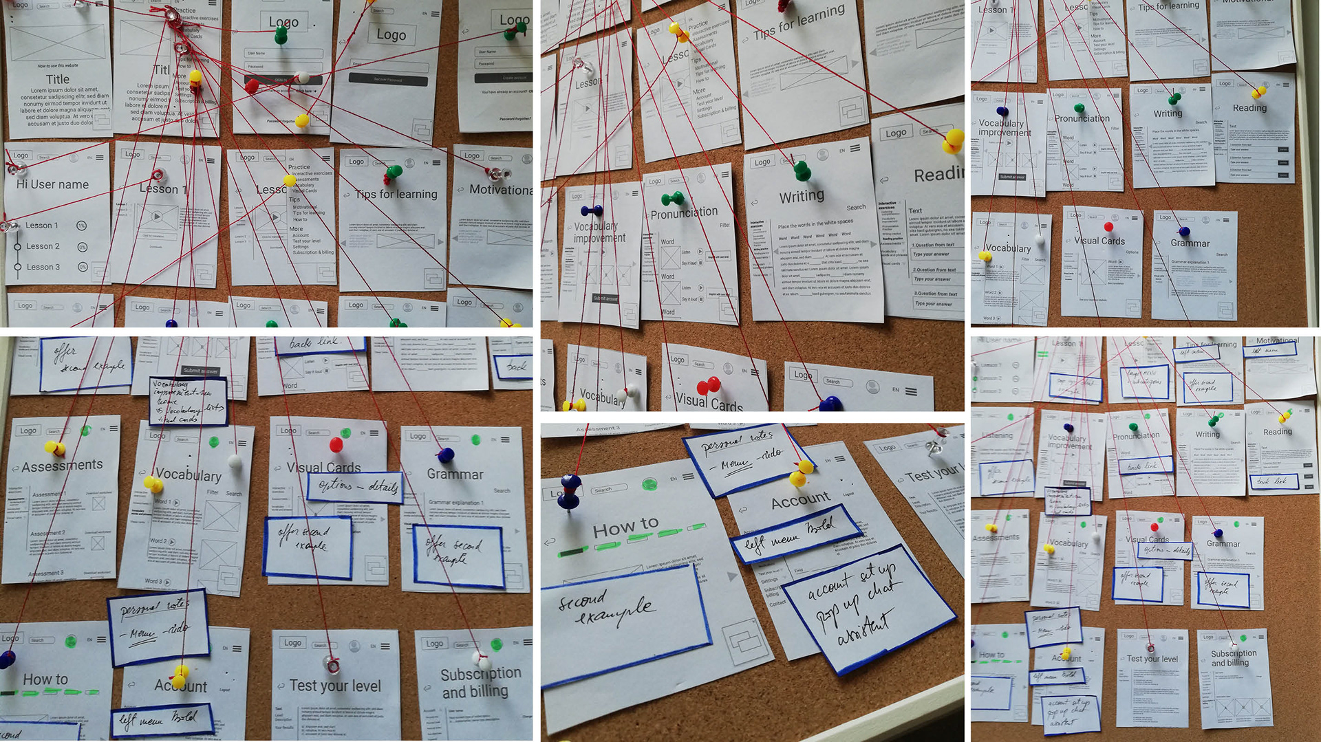
After making the low resolution wireframes, I made a close-up diagram using colored yarn to represent navigational connections and to have a better view of the entire design.
Changes I made after analyzing wireframes and receiving feedback for them:
After revisiting the information architecture, I noticed some problems that had to be fixed. Here are some examples:
- there were 3 screens with the name Vocabulary, that were approaching the richness of words known by users but in different manners (visual cards, words explanation and pronunciation). I decided to change the name of one screen in Lexicon (where is list words and phrases, each having an audio, an image and a translation), to delete the one pronunciation and to integrate this at the Speaking practice screens and the other to keep the name Vocabulary Improvement.
- there were 3 screens with the name Vocabulary, that were approaching the richness of words known by users but in different manners (visual cards, words explanation and pronunciation). I decided to change the name of one screen in Lexicon (where is list words and phrases, each having an audio, an image and a translation), to delete the one pronunciation and to integrate this at the Speaking practice screens and the other to keep the name Vocabulary Improvement.
- it was missing the screen for Personal notes and a clear example with Chat buddy screen
- there was no screen that offered the option to select the language. Even though in the beginning the MVP will offer just one set of translation - English- German, there is better to place this selectable field in the beginning of the learning path to avoid misunderstanding of user looking for another language.
- the burger menu was long and with too many categories. I split the ones for content and learning on the left side menu. Easy to manipulate during navigation. The left menu will be the only one available and partial, for visitor users, without signing up.
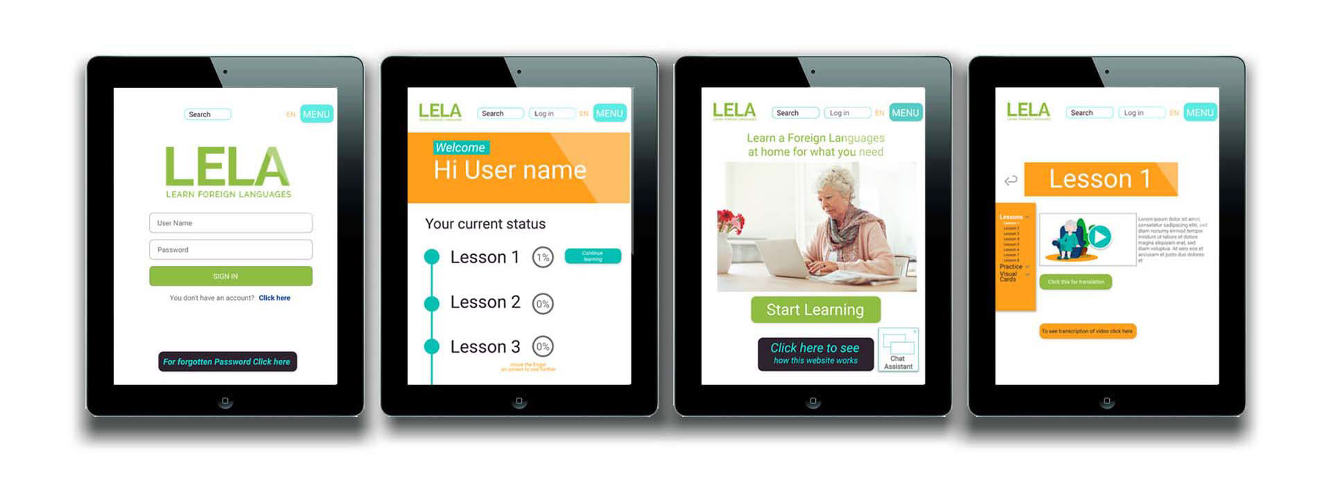
I use in the design two shades of blue, to emphasize the buttons and some Categories. It is much more clear for the user where he is in the site navigation
I put a graphic for the four parts that help enhance a new language: Listening, Reading, Speaking/pronunciation and Writing.
The screen's dimensions are designed for a tablet, which according to statistics, is the most used devices from seniors.
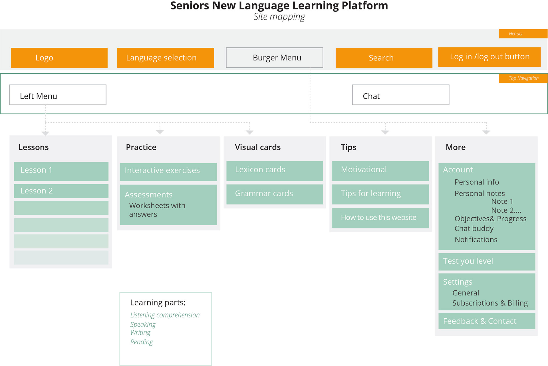
New version site map
Interactive prototype for testing
Learnings
One challenge for me was to find the level of detail for visuals materials at each phase. It is hard to let go of sketches or drafts of work, that have some aesthetics issues, even though they fulfill their functionality. Learnings: sometimes “done is better than perfect”.
A second challenge was the limited time. For example, for the Analyzing phase, I needed more time than estimated. Learnings: prioritizing and choosing the best-fit methods according to budget/time is a great skill to have as a professional.
Another challenge I faced, was to keep track of all the changes and version control over the weeks, after receiving the feedback, learning new things on course and after analyzing the design itself. Learnings: organize, organize organize.