
The Project
Activ Fitness is a successful Swiss Fitness Center Group with more than 75 studios. It offers different services in the fitness sector based on paid membership.
The objectives of this case study are to find potential opportunities to improve the usability of the main website and the user experience for new and returning users.
The objectives of this case study are to find potential opportunities to improve the usability of the main website and the user experience for new and returning users.
My role as UX/UI Designer in this project was to make the audit of the website, to conduct contextual inquiry and user testing for finding the main problems and pain points of the users, to analyze gathered data and to design solutions based on these insights.
Assumption
There is a potential to improve the digital experience and clients’ satisfaction by redesigning the website. There are usability and design problems, that once fixed might improve the user experience tremendously.
Constrains
The main constrain was the lack of internal metrics for the website, because this is not a direct client. To have more real data, I included the public comments from social media accounts (the Facebook account of each club) regarding the website and user experience. The timeframe for this project was 5 weeks and there was no budget for participants' participation, all are voluntary.
The main constrain was the lack of internal metrics for the website, because this is not a direct client. To have more real data, I included the public comments from social media accounts (the Facebook account of each club) regarding the website and user experience. The timeframe for this project was 5 weeks and there was no budget for participants' participation, all are voluntary.
User and audience
Activ Fitness offers, based on membership, space for different types of sport and fitness classes with a professional trainer, along with a relaxation area including a sauna, massage, solar, babysitting and parking. The facilities, schedule of group classes, or even the number of fitness equipment differ from one center to another. Activ Fitness also promotes movement and sports activities, and they organize different events or camps. From the legal point of view, starting with 16 years old it is allowed to become a member. Based on the above mentioned, the target group is quite large 16 to 85+ years old, with no specific criteria (no tech-savvy, personal endurance, sports awareness and so on). So people with less experience in digital devices or beginners in fitness need to reach and understand the information from the website.
Approach and Process
After the website's audit for the different screen sizes ( desktop, tablet and mobile), taking into consideration the usability, functionality, design principles and heuristic evaluation, they emerge a series of problems. The Process I've used has at its base the UX wheel: Understand - Design - Prototype - Evaluate.
To avoid biases, to check if the hypotheses with the problems and priorities are confirmed, I conducted a moderated interview with 4 participants. For more insights regarding methodology click here.
Here are the 3 major categories with problems found:
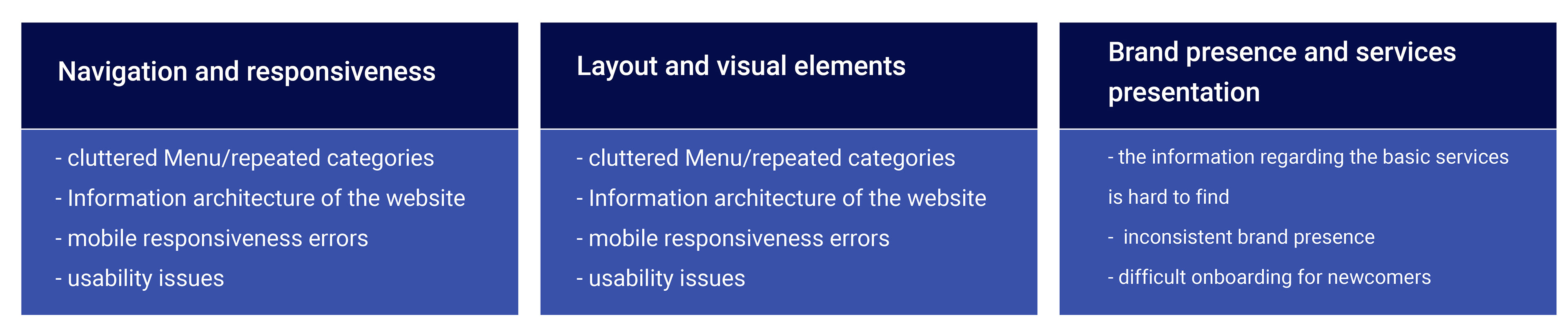
Click here to see more details about brand presence and services presentation.
Design Ideation
After the analysis of the current website and the research, below are the suggestions to keep considering for the re-design.
Suggestion 1: A review of the information architecture is a must. Declutter the information from the website. Keeping the needed information at reach (like value proposition, the differentiator between studios, he most used services visible and clearly explained). Some categories could be transformed into PDFs to be downloaded if some users want to know more detailed information, like the contract types and general regulations for using the space and equipment of studios. Delete the excessive text where possible or include videos to illustrate instead- for example for the description of the types of fitness classes. This will allow creating a new site map, with a shorter Menu.
Suggestion 2: Redesigning the homepage with the following elements included*:
- Visuals
- Value proposition
- Call to action button (e. g. Subscribe to the newsletter, or choose your preferred Studio to see details, buy a seasonal ticket, sign up for a trial Training )
- Log in area
- Search field
- Languages
- Value proposition
- Call to action button (e. g. Subscribe to the newsletter, or choose your preferred Studio to see details, buy a seasonal ticket, sign up for a trial Training )
- Log in area
- Search field
- Languages
* according to best practices from Google experts the above elements should be included for raising the conversion rates on the homepage of each website.
Suggestion 3: Apply a new color scheme, according to the www.W3.org standards, with a contrast between text and background. The new design should be minimalistic, with vibrant colors and high contrast going to a dynamic style and friendly look. Regarding the style, a classical one would be more appropriate, taking into consideration that the target audience includes seniors. o accomplish this, it is important to keep in mind the brand guidelines and regulations, the desired marketing strategy and the brand identity guidelines.
Suggestion 4: Add more interactivity to elements. E. g: for the babysitting, parking or massage, the icons could be interactive, having added a link or a potential pop-up window with a schedule for each studio. This will give the chance to quickly jump to needed information, without going to the Menu and choosing the category.
Suggestion 5: Make the design responsive for smartphones. There is no doubt that today this is the most used device to surf the internet for a fast reach of information like studio facilities, babysitting time, or group class schedule.
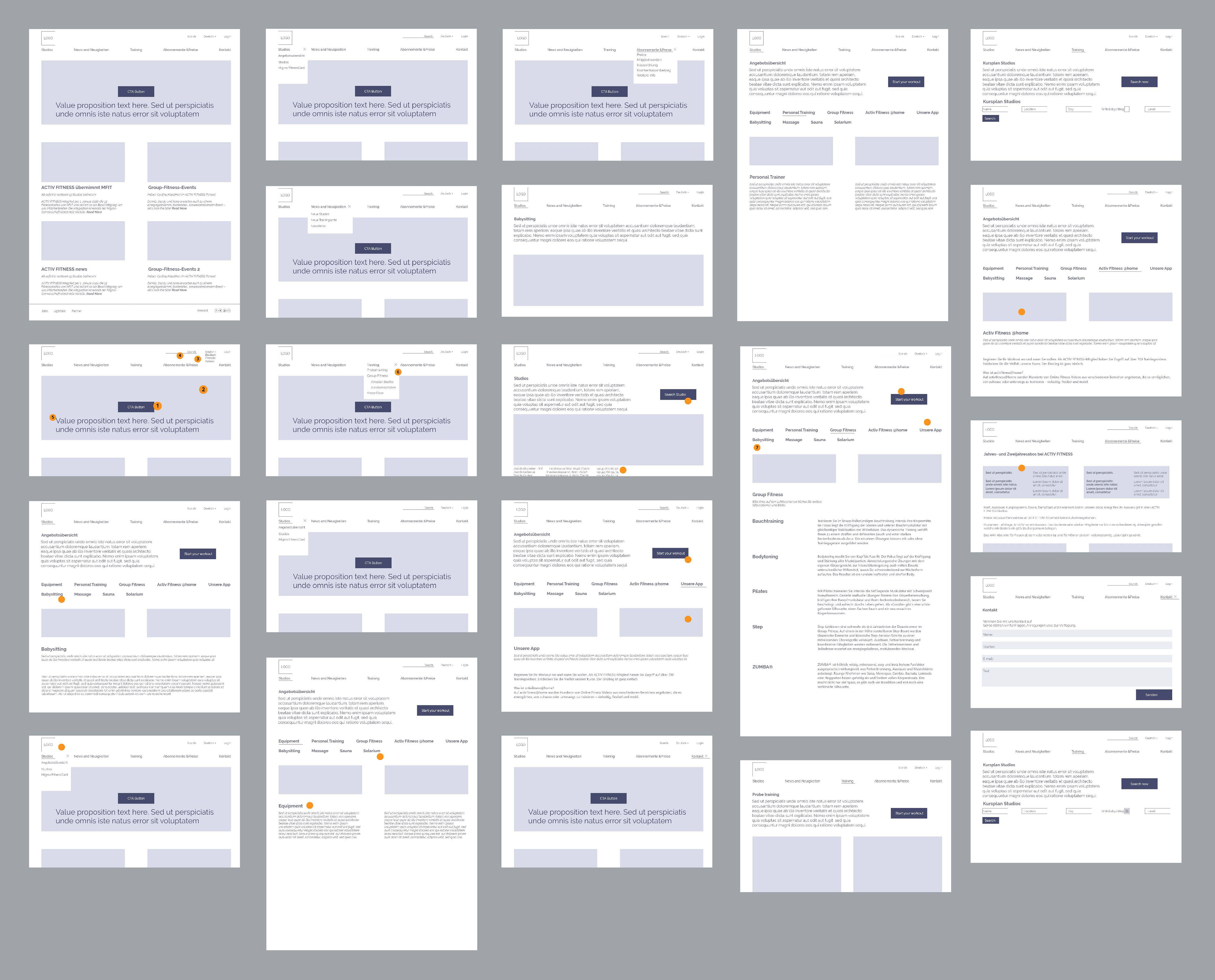
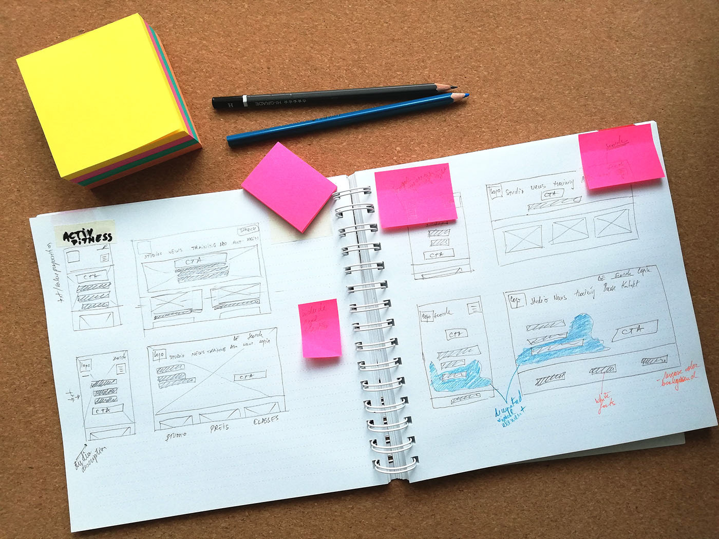
Wireframes low fidelity
To find the proper solution for all the above-discovered problems and findings, I have created first the low fidelity wireframes. This helped to check if the new Information Architecture and the menu are including the most used information or categories. To further test, I've created an interactive prototype (click here) and asked 3 person to see if they can complete some basic tasks (look for a certain studio, find the basic services, find the next available group class with Pilates in your area). Also the user flow was mandatory to check, to see if the user have the possibility to return or jump to a desired category.
After few ideation phases, I decided which layout will fit best all the findings from the previous stage.
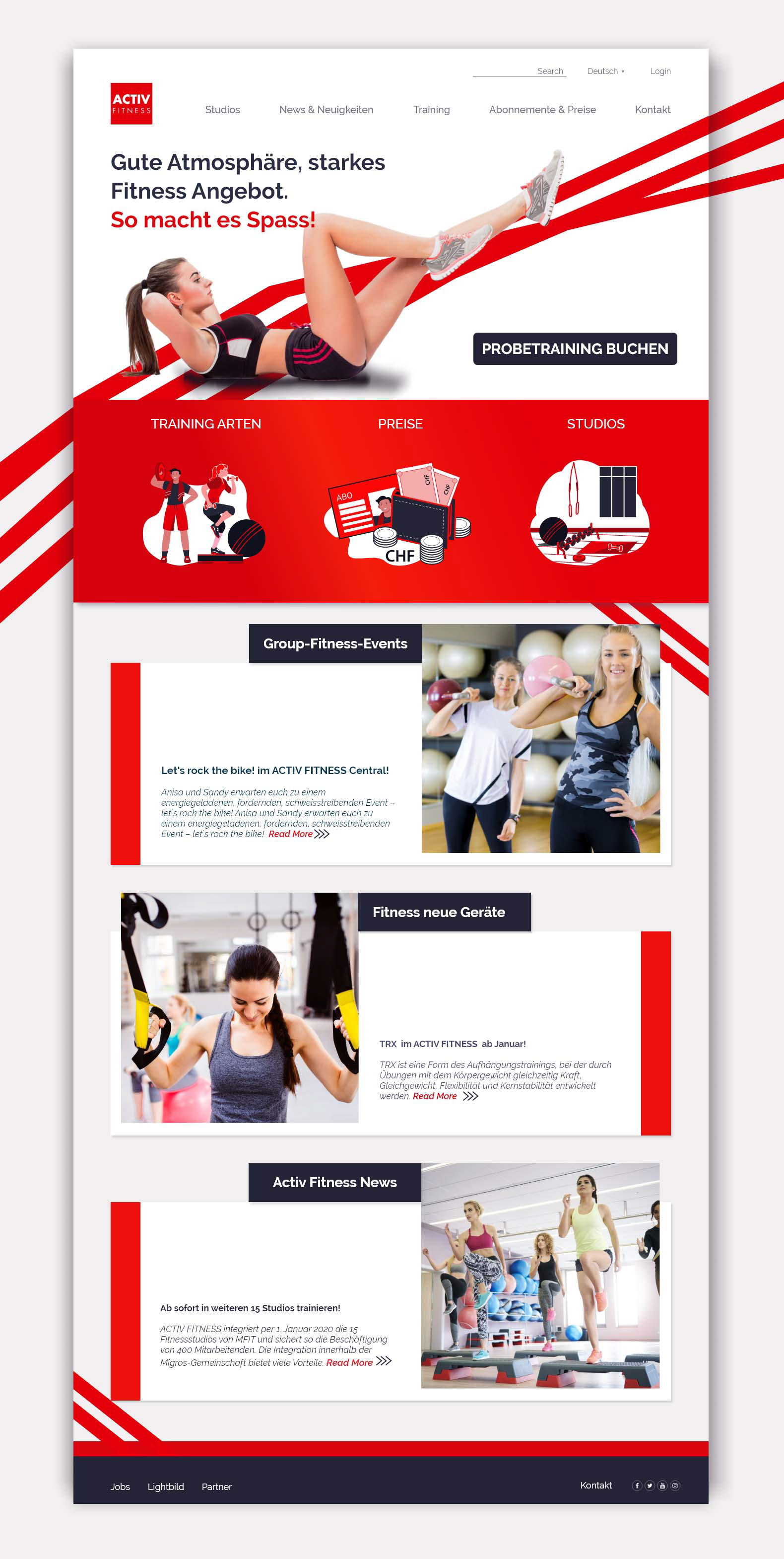
Final design for Homepage, desktop version
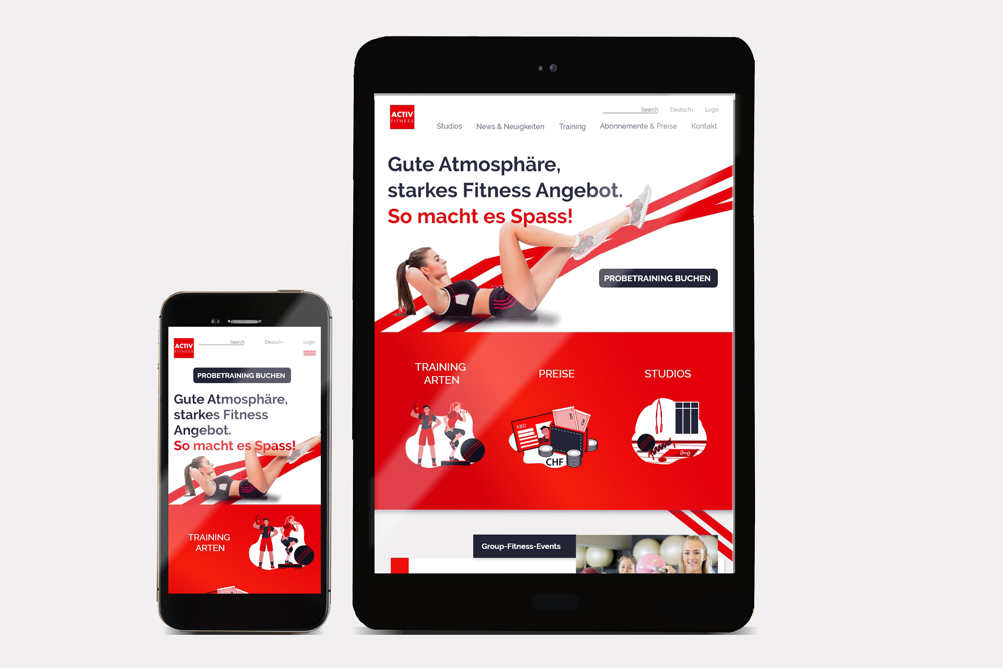
Final design for Homepage, mobile and tablet version
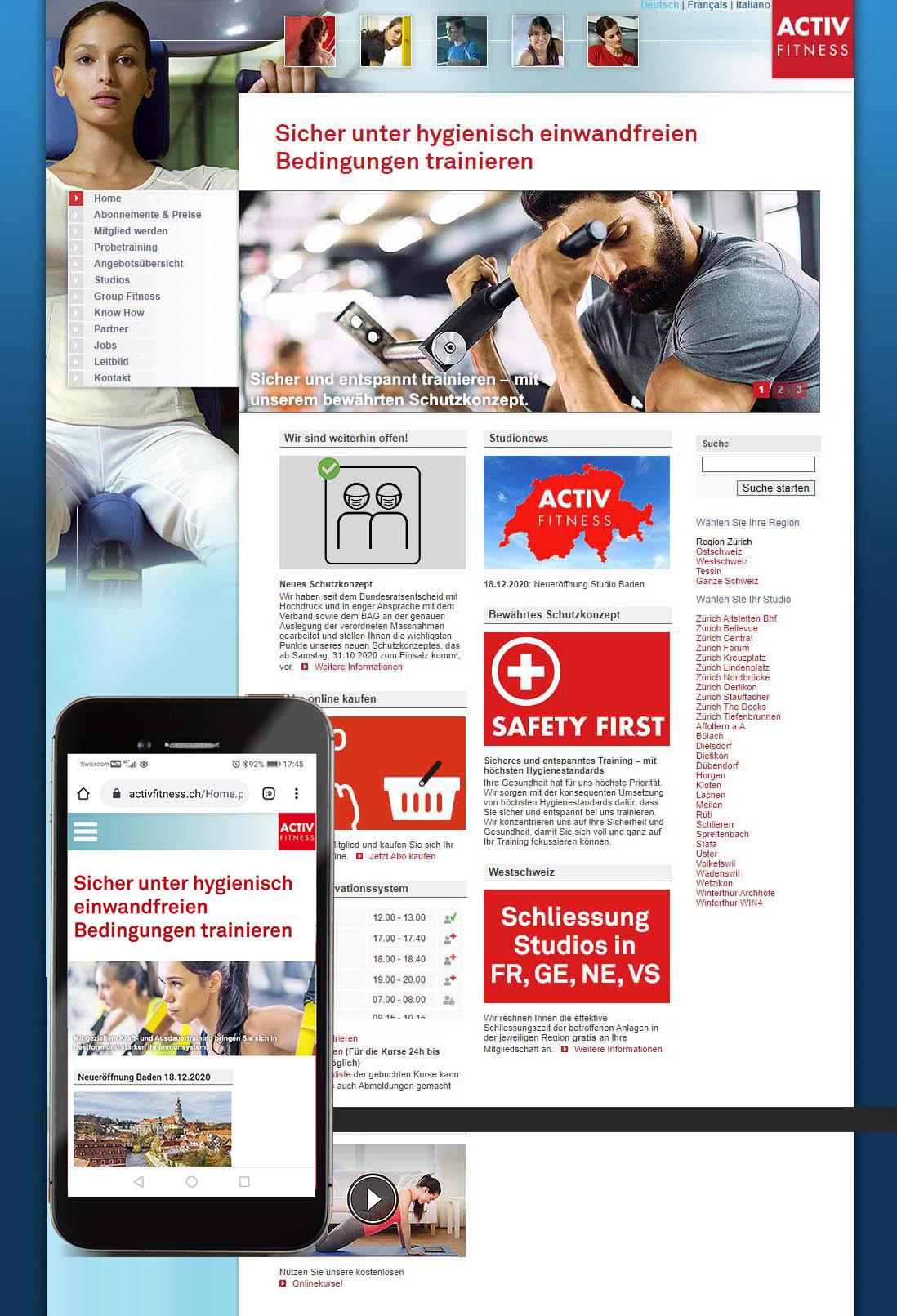
Before
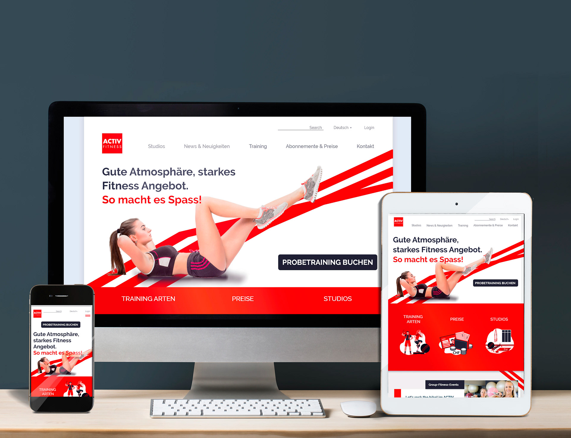
After
Next Step
My next step for this project would be to assess create the high fidelity designs for each page.