The current Information Architecture of the website has multiple pages that treat the same subject differently.
The studio description has 3 distinctive pages, each containing chunks of information but none of them contain all the information spread on other pages.
The description of the group classes' types is treated on 2 different pages, each in a different manner.
The studio description has 3 distinctive pages, each containing chunks of information but none of them contain all the information spread on other pages.
The description of the group classes' types is treated on 2 different pages, each in a different manner.
The Menu is cluttered with lots of unnecessary(long body texts) or repetitive information, which leads to confusion and extenuation of the user’s attention. The information should be easy to find and the content easy to navigate. The issue was brought to attention by 2 participants during the contextual inquiry. Both of them opened the site on mobile phones and were overwhelmed by the amount of text.
The Menu is long, and because the labels from categories are changing the position on the screen once clicked, the users no longer knew where they are and what they clicked before. This is a problem regarding the responsiveness of the design and consistency that damages the user experience.
The Menu is long, and because the labels from categories are changing the position on the screen once clicked, the users no longer knew where they are and what they clicked before. This is a problem regarding the responsiveness of the design and consistency that damages the user experience.
There are issues regarding flexibility and efficiency of use (Nielsen Heuristic principle nr. 7) and the help and documentation provided (Nielsen Heuristic principle nr. 10). All these decrease the conversion rate of the website.
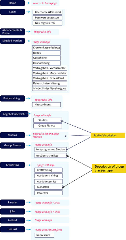
Information architecture for the current version of the website