
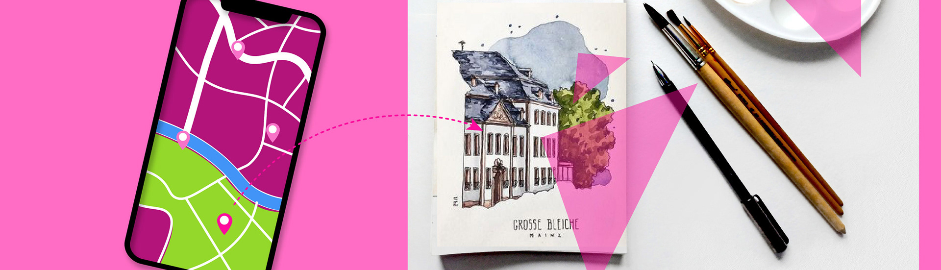
Walk&Sketch is an app that allows people to quickly find ideal places to sketch, to attend meetings, workshops and tours with this theme or activity in mind. This project is part of Google UX Design Certificate and is focusing on Switzerland, but it can be adapted and scaled to other countries or regions. My role was as Product & UX designer, working from idea to a high fidelity prototype.
Project overview
The problem:
People passionate about sketching on location lack the time necessary to look for ideal places to draw or sketch.
The goal:
Design a tool that facilitates users to easily find a location to sketch, based on their preferences, and to attend activities (meetings, workshops, tours etc.) with this theme.
Understanding the users
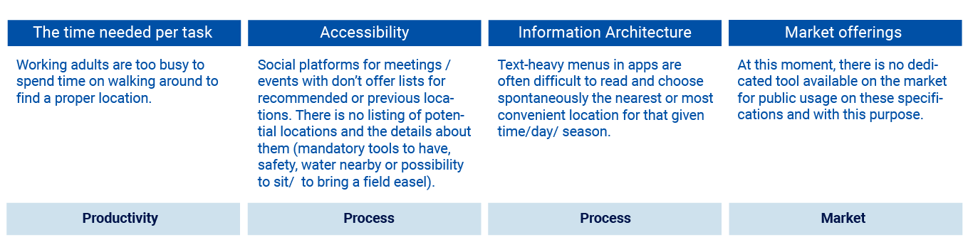
After completing user research, the following pain points were identified:
Also during the research revealed that the main digital device used will be a smartphone, therefore the design approach was progressive enhancement: first designs and testing will be on smartphone screen size and after proof of concept and design testing, the design for bigger screens will be created as high fidelity prototype.
Starting the Design
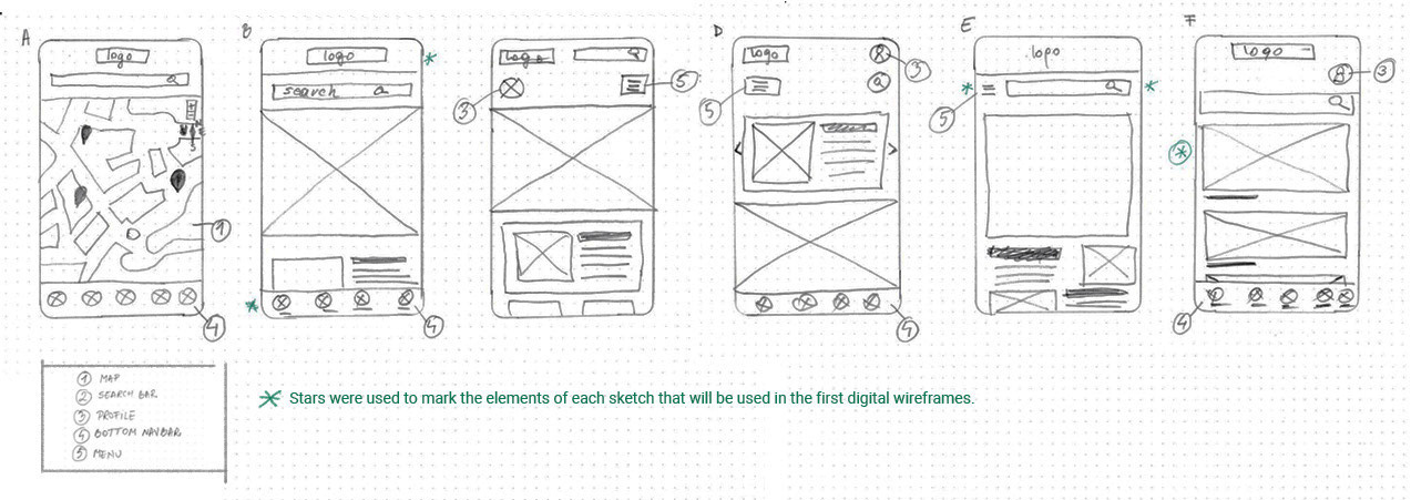
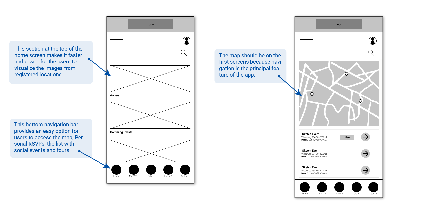
Hand drawing iterations of multiple app screens on paper ensured that the elements that made it to digital wireframes would be well-suited to address users pain points. For the home screen, I prioritized a quick and easy finding process to help users save time.
Digital wireframes
As the initial design phase continued, I made sure to base screen designs on feedback and findings from the user research.
Usability study
Early designs allowed for some customization, and after the usability studies, I remove the Menu (1) and the profile access (2) from the top, because of hard accessibility. I reduced the bottom navigation bar to 4 categories (3) and included the “Sign in” (4) there. Also, I revised the designs so users can access information with a tap or swipe on the main categories.
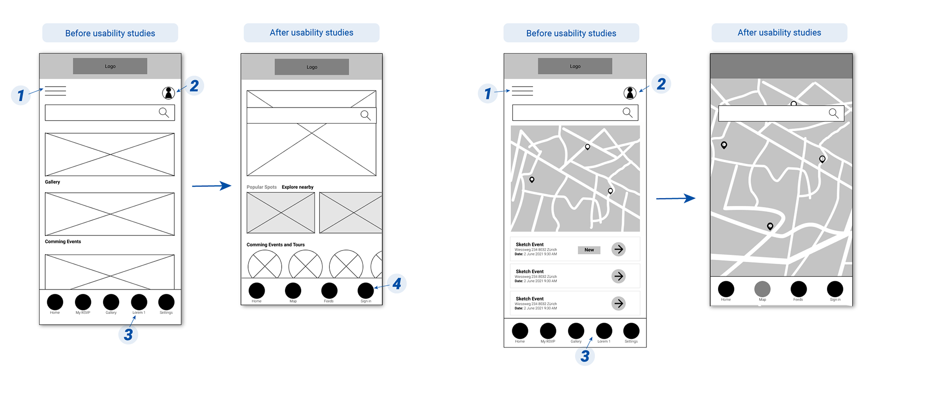
One question raised at this point was: what assistive technology should be considered in the design process for this app?
Before further answers, all visuals have labels underneath and there are easily accessible for left or right-handed people.
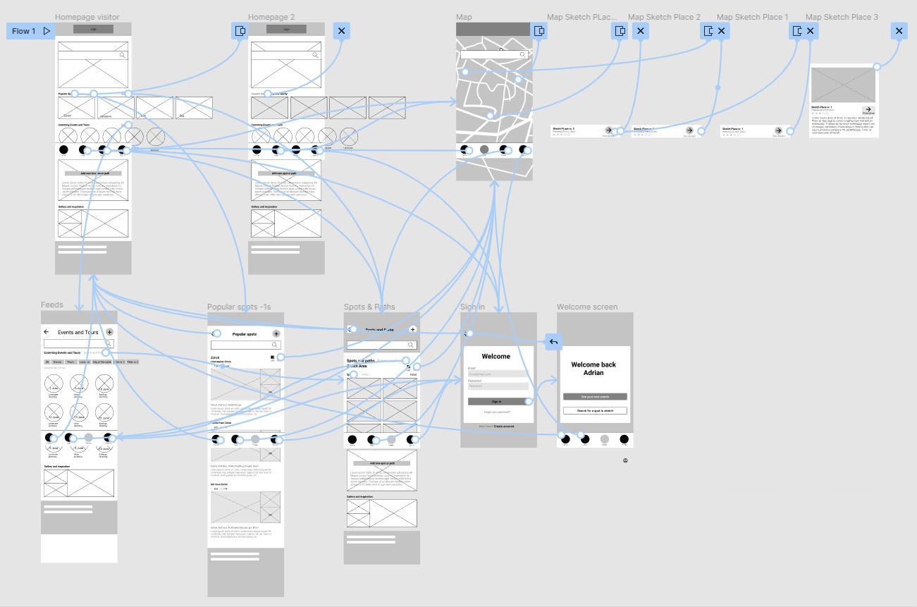
Using the completed set of digital wireframes, I created a low-fidelity prototype. The primary user flow I connected was searching and finding an organized event for sketching on location as a visitor (not signing in), so the prototype could be used in a usability study.
Click here to see the low-fidelity interactive prototype.
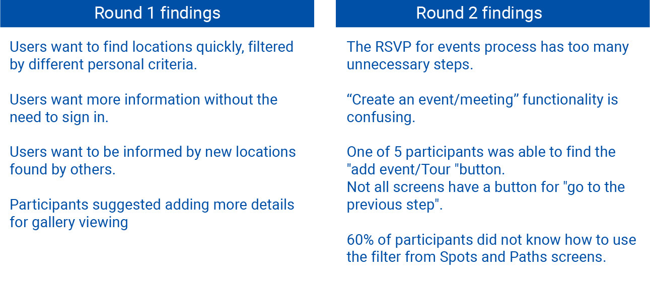
Usability study findings
I conducted another two rounds of usability studies. Findings from the first study helped guide the designs from interactive wireframes to medium-fidelity prototype. The second study used a medium-fidelity prototype and revealed what aspects of the mockups needed refining.
Refining the design
After creating the Brand Identity and design system (see here more details), the refine of the design took place.
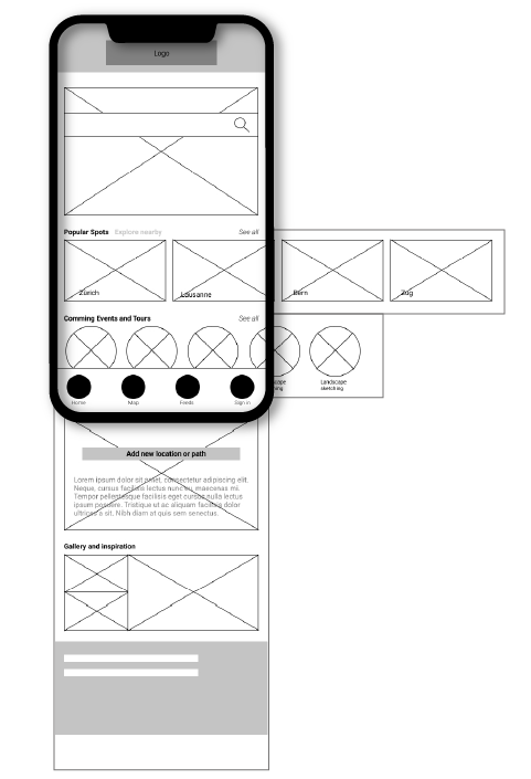
Mockups
Early designs allowed for some customization, but after the usability studies, I changed the clutter spaced from the home screen and have less buttons on the button navigation bar. I also revised the design so users access information with a tap or swipe.